Accessibility
As more and more information and teaching is placed online in order to support better learning and skills development, especially as part of a more blended learning approach it is essential to ensure that all content that is added is accessible for as many users as possible.
Around 20 percent of people in the UK have reported some form of disability. In addition, many disabilities may remain undisclosed, so it is not always possible to determine if some people may need additional support. To help ensure that everyone’s needs are met, inclusive design should be used within individual pieces of learning content so that all content and tools may be accessed and comprehended by all users. At the wider level, the concept of a universal design for learning must also be used, building on inclusive design to create a single learning experience that can be accessed by most people. Once this has been achieved, it makes it easier to manage course content as only one version of a course needs to be produced for all students.
Having accessible content is also now a requirement of accessibility legislation, brought in as part of the Equality Act 2010. As such, these are principles that must be followed in online systems such as Blackboard as well as any documents that are produced for teaching in Word, PowerPoint and PDF formats. Standards which must be met are based on the Web Content Accessibility Guidelines (known as WCAG 2.2 at the AA level), maintained by the World Wide Web Consortium (WC3). The government’s Understanding WCAG 2.2 page provides a simple guide to the full design principles and requirements.
Below you will find useful tips on how to meet these legal obligations for your teaching, and how best to support your learners.
Documents
All documents used in your teaching must be accessible. This includes all Word documents, PowerPoint presentations and PDF files. Accessibility in documents follows the same principles as all other online content:
- Alternative text must be used to describe any images that are added
- Colours must have an accessible contrast
- Fonts should be sans serif such as Ariel or Helvetica
- Font size should be legible (at least 12 points or above)
- Sections should be structured using heading levels (H1, H2 or paragraph)
- Tables should only be used for tabular data, with table headings clearly marked
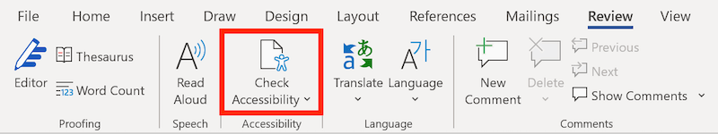
There are two main ways to check that your documents are accessible. In Word or PowerPoint, you can use the built in accessibility checker. This will pick up most problems and offer advice on how to fix each one. To access this feature, click on the review tab, and then click on the Check Accessibility button (you can also check PDFs similarly using the Adobe PDF Checker):
The second way to check accessibility is by using the Blackboard Ally accessibility checker tool, which analyses all documents uploaded and currently in use on a Blackboard course area. This tool also recommends changes you can make to improve the accessibility of your content and describes why this is important on a case by case basis.
Alternative Text
Alternative text, or alt text is a simple description, usually less than 125 characters that describes the meaning of an image or diagram. This enables assistive technology such as screen readers to be able to read out the full contents of a page or document so that it can be fully understood without a user needing to be able to see it.
All images used in your online Blackboard courses, Word documents, PowerPoint presentations and PDF documents must include an alternate description so that all relevant information can be conveyed to all learners.
If an image does not have a particular meaning that is relevant to the content it is placed with, it can instead be marked as decorative. For example, this may be suitable for an image that is there to make the page more attractive, to make content more readable by breaking up blocks of text, or because the image does not relate to the content. To mark an image as decorative, you can enter alt=”” in the description field.

Video and Audio Captions
Captions must be added to all video that is hosted for learning and teaching. This includes all videos added to Blackboard, PebblePad, Box of Broadcasts or any other online tool or service.
Structure and Fonts
Headings

Font Choice
Font Size
The larger the font size you use, the easier to read the text tends to be. In general, documents and text in Blackboard courses should be set at size 14 for clear readable text (and no smaller than size 12).
Web Links
Links to websites can be added into any Blackboard course, or PowerPoint presentation. Current guidance is to avoid adding the full link URL as part of the text, unless it is a very short link, or if you are expecting the page to be printed out. Screenreaders must read out the full link, and in some cases this can take a very long time to read out each time.
You should also not use wording such as “click here”, “read more” or any other phrase that has no additional context. Links should be used within the text description itself.
Tables
You should only use tables to present data, not for laying out text or images. All tables should include a designated header so that screenreaders can read these out to distinguish them from information in the cells.
Colour
Adding colour to your materials can be a good way of improving readability and engagement. However, incorrect usage can do the opposite!Contrast
Use of colour must be considered very carefully as this can determine how easy your content is to read. Light text on a light or white background results in poor readability and a poor user experience for all users. The contrast between the background (which is usually white in Blackboard and in Microsoft Word) and the colour of the foreground text must have a contrast ratio of at least 4.5:1 to be sufficiently visible. Use the WebAIM contrast checker page to test the colours you wish to use to ensure accessibility for the text you are using. You can find out more about what colours you can use in Blackboard from the Accessibility page in the Blackboard Manual.Example of some text which meets the accessibility requirements of colour contrast, using dark text on a light grey background.
The example above has a good contrast ratio of 7.3:1
Example of text which falls below the required contrast ratio of 4.5:1, using a light colour on a white background.
The example above has a poor contrast ratio of 2.9:1
Meaning
Colour alone should not be used to convey the meaning of any item displayed on the screen. Using colours for text such as red to denote that something is important is insufficient in itself for users to understand. This is especially important for people that may be colour blind, and have difficulty distinguishing red from other colours.
The examples below display images with a range of colours. The left image shows what this looks like to someone who is not colour blind. The image on the right shows what the same range of colours looks like to someone that has the most common form of colour blindness.


You may still use coloured text and graphics in your resource materials, but if you do, you must also use additional techniques to ensure that the meaning behind this is conveyed properly. This can mean adding additional text to explain what his colour means, or using additional visual cues.
Blackboard Ally
Any document or image you use as part of your teaching which is uploaded to Blackboard is automatically processed by the Ally tool. All items checked receive a score represented by a coloured gauge icon, visible only to tutors which indicates how accessible each item is. A red icon means very poor accessibility, amber means that accessibility can be improved and green means that accessibility is good.
Click one of these icons to reveal how to fix or improve the issues identified, and learn the reasons behind why you should do this. Some items such as images uploaded to Blackboard can be quick fixes as the software can add alternative text without opening any other windows or dialogs. Problems found with uploaded documents must be fixed in Word or PowerPoint, and then re-uploaded to overwrite the old, inaccessible versions.

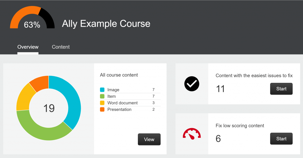
Course Reports
Ally also provides the ability to get an overall view of how accessible the documents and content of an entire course is by using the Course Report feature. This is available in every Blackboard course area and gives you a dashboard overview of all accessibility issues in one place. You can view the breakdown of which kinds of elements have the most issues, and allows you to filter the easiest issues to fix, or the lowest scoring items. Click on any issue from these lists to implement your fixes.
Alternative Formats
When uploading documents and content to your Blackboard courses, you only upload a single accessible version. However, some users may not be able to access that version well, or may prefer it in another format. Instead of consuming the content in a Word document, they may prefer to listen to is as an MP3 audio file, or an ePub file compatible with an eBook reader. If they have additional needs, they may prefer it in a Braille format. Ally provides a mechanism to automatically create these formats and more on request. For every item of content uploaded, users will see an A icon with a downward pointing arrow. Once clicked on, a choice of alternative formats will appear. Any of these can be selected, and then downloaded.

Manual Checking and General Tips
Although Microsoft, Adobe and Ally provide accessibility checkers which pick up many accessibility issues, there are some that cannot be detected because they are related to user choice and how content is constructed. When you are reviewing your content for accessibility, it may be useful to consider the following:
- Use larger fonts (14pt)
- Minimise the use of italic fonts which make it harder to read
- Use Ariel, Verdana or Helvetica fonts
- Use simple language where possible
- Use images to break up large blocks of text in a page
- Think about keyboard users who navigate without a mouse (use fewer folders and less clicks to find content)
- Think about how you use colour to best support colour blind users
- Keep the menus in Blackboard consistent so that students always know where to find common important information such as assessments
- Where possible, provide materials in advance to students